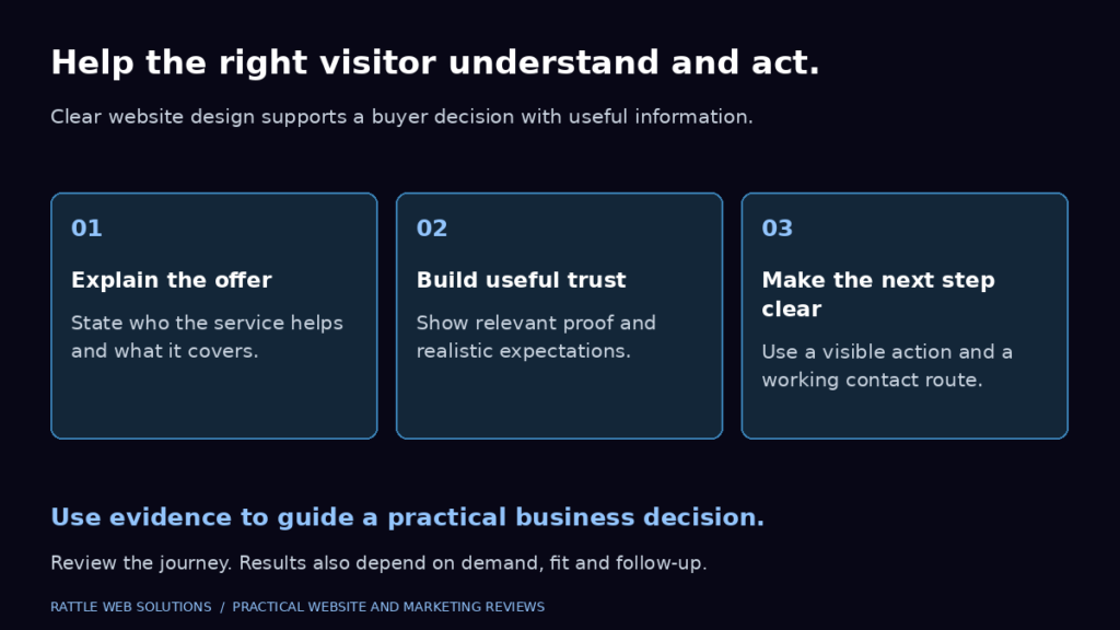
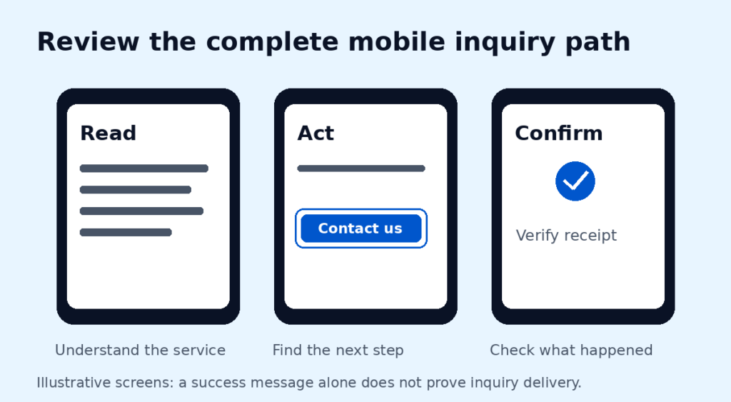
A mobile review should answer a practical question: can someone understand your service and take the next step on a small screen? Test the actual journey before assuming a redesign is needed or claiming that a particular issue has cost customers.
Follow one useful route
Start on a page a buyer could reasonably enter. Find the relevant service, read its scope, look for evidence and reach the contact options. Record the device, viewport and steps tested so another person can reproduce any problem. Do not submit a test inquiry without authorization.
Look for these barriers
- Reading: text that is too small, cramped or difficult to distinguish from its background.
- Navigation: unclear labels, obscured menus or controls that are hard to activate.
- Comparison: tables that squash columns or push the whole page sideways.
- Contact: hidden labels, confusing required fields or errors without a useful explanation.
Check more than a phone screenshot
Use keyboard navigation to check reachable controls and visible focus. Where a wide table needs horizontal scrolling, check that its scroll area is understandable and usable. Review headings and labels rather than relying on appearance alone.
If motion is present, inspect the reduced-motion behavior and make sure essential content remains available. A calm design can still fail if a button disappears behind an overlay or important information is only revealed by an effect.
Separate observations from explanations
“The menu covers the contact link at this width” is an observation. “This caused lost sales” needs additional evidence. Likewise, assess loading with an actual measurement and record its conditions rather than inferring a performance score from how a screenshot looks.
Choose a small first fix
Prioritize a reproducible barrier in the buyer journey. Apply the change, repeat the same steps and check nearby widths for regressions. Keep before-and-after evidence. If no relevant tracking is available, do not report a conversion improvement.
Should every paragraph be wider on mobile?
No. Review readable line lengths, spacing and hierarchy together. Use the available width purposefully without turning comparisons or dense text into a new reading problem.
For a review that leads to implementation, compare the observed issues with our service-business website design scope and agree the mobile acceptance checks before work starts.
We’ll assess your current mobile journey and recommend a direction based on the barriers we can verify. Each business needs its own review; a checklist helps organize the work, but it does not replace that assessment. Discuss your requirements.