
When those answers are hard to find, even interested visitors may leave, postpone the decision or contact the business without enough context. A clearer page can reduce that uncertainty. It cannot guarantee an inquiry, because demand, traffic quality, pricing, trust, competition and follow up also affect the outcome.
For a service business, the goal is not to decorate every page. The goal is to help the right visitor understand the offer and complete an appropriate next step with confidence.
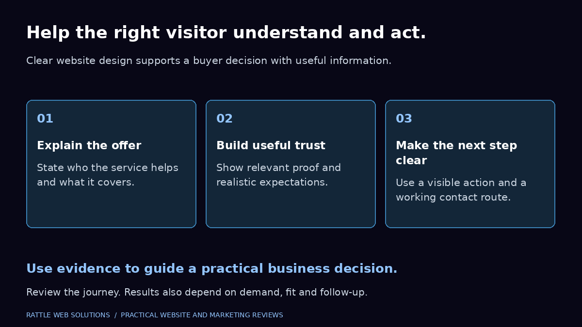
Start with the visitor’s decision
Many business websites are organized around the company rather than the visitor. The navigation reflects internal departments. The home page lists broad capabilities. The contact button appears everywhere, but the information needed before contact is missing.
A visitor normally needs a simpler path:
- Recognize that the page addresses the problem they are trying to solve.
- Understand the service and its boundaries.
- See enough proof to judge whether the business is credible.
- Know the next step and what will happen after taking it.
This path does not need to be identical for every visitor. Someone comparing providers may want scope, process and pricing guidance. Someone who already knows the business may want a direct contact route. Clear design supports both without forcing everyone through the same sequence.
Make the offer understandable before asking for contact
A strong service page explains the offer in the language a buyer uses when describing the problem. It should make the following information easy to scan:
- The problem the service addresses
- Who the service is suitable for
- What is included and excluded
- How the work is approached
- What information or access the client must provide
- How pricing or scope is determined
- What the buyer can do next
Clarity is especially important when the service combines several disciplines. A business looking for a website may also need content, search visibility and measurement, but combining everything into one vague promise makes the decision harder. Explain the immediate service first, then show related support through relevant internal links.
Rattle’s website creation service follows this approach by separating audience fit, scope, process and next steps rather than treating every website as the same project.
Use navigation to support real buyer questions
Navigation should help visitors move between the decisions they are likely to make. For most service businesses, that means a concise path to services, pricing guidance, proof, information about the business and contact.
Review navigation with these questions:
- Are service labels specific enough to understand without opening every page?
- Can a visitor reach a relevant service page from the home page?
- Can a visitor move from the service page to proof, pricing and contact?
- Are important links visible and usable on a narrow screen?
- Do buttons lead where their labels promise?
- Are old pages competing with the current service page for the same purpose?
More menu items do not automatically create more clarity. If two pages answer the same buyer question, decide which one should be the main destination before adding more links.
Give each page one clear primary action
A page can contain several links, but its main action should be easy to recognize. A service page might invite the visitor to request a lead plan. An educational article might invite the reader to review the related service or contact the business with a specific problem.
A useful action label describes the outcome. Compare “Submit” with “Request a lead plan.” The second label gives the visitor more context. The surrounding copy should also explain what information is needed and what happens after the form is sent.
Avoid making every sentence a sales prompt. A primary action becomes harder to recognize when multiple buttons compete with equal visual weight. Supporting links can remain available without looking like the main step.
Design forms for completion, not appearance alone
Forms are part of the service experience. A polished page can still lose an inquiry if fields are confusing, labels disappear, errors are unclear or the form is difficult to use on a phone.
The W3C recommends clear labels, instructions, input validation and completion feedback. It also advises asking only for information that is needed for the transaction or process. Visible labels are more reliable than placeholder text that disappears as the visitor types.
For an initial service inquiry, consider whether every field is necessary at that stage. Name, contact details, company or website, service needed and a short problem description may be enough to begin. Budget, detailed scope and timing can be optional or collected later when that produces a better experience.
Review the form on a narrow screen and with keyboard navigation. Check that:
- Every field has a clear visible label.
- Required information is identified before submission.
- The correct keyboard appears for email and phone fields on mobile devices.
- Error messages explain what needs to be corrected.
- Focus moves logically through the form.
- The success message confirms what happened without making promises the business cannot keep.
- A failed submission does not appear to be successful.
Accessible form practices help more people complete the task, including visitors using assistive technology, keyboard navigation or a small touch screen. See the W3C accessible forms tutorial for implementation guidance.
Keep mobile layout readable at the difficult widths
Mobile design is not just a desktop layout made smaller. Headings, cards, process steps, tables and forms need enough width to remain readable.
Test the page at several narrow widths, including the points immediately before and after the layout changes. Look for:
- Cards that stay in two or three columns when they should stack
- Words wrapping into short fragments
- Buttons or fields extending beyond the viewport
- Large images pushing important text below the fold
- Hidden sliders or decorative elements creating extra page width
- Text and controls that become difficult to read or select
A responsive rule may exist in the editor while the public page still behaves differently because of cached styles, theme settings or plugin output. Editor preview is useful evidence, but the public page should also be checked before the repair is considered complete.
Use proof that helps the buyer decide
Trust does not come from adding more impressive numbers. It comes from information that is specific, relevant and verifiable.
Useful proof may include:
- A real case study with approved facts and clear measurement definitions
- Screenshots or examples the client has permitted the business to show
- A transparent process and clear ownership responsibilities
- Relevant experience that can be substantiated
- Honest boundaries around what the service can and cannot control
- Consistent business details and working contact routes
Do not present stock photographs as customers, generated images as completed client work or an illustrative dashboard as measured performance. If an image is conceptual, its role should be clear from the surrounding page.
Measure the right action
A website click, a form submission, a qualified lead and a sale answer different questions.
Google Analytics can record a specific lead form submission as a key event when the event is configured and validated correctly. That still does not establish that the inquiry was genuine, suitable or converted into a customer. Those outcomes require business records or feedback from the team handling inquiries.
Use a simple measurement chain:
- Contact click: The visitor selected a phone, email or messaging link.
- Inquiry received: A form was submitted successfully or an incoming inquiry was verified.
- Qualified lead: The business confirmed that the inquiry fits the agreed criteria.
- Customer or sale: The outcome was recorded in the relevant business system.
These signals should not be merged into one conversion number. A button click may show interest but does not prove that a conversation happened. A form success event may show an inquiry but does not prove commercial fit.
Rattle’s conversion tracking setup is structured around these distinctions so reporting can support decisions without overstating business outcomes.
A practical website clarity review
Use this checklist on the home page and the most important service page.
Offer
- Can a visitor describe the service after reading the first screen?
- Does the page name the buyer problem rather than only the agency capability?
- Are scope and exclusions clear enough to reduce unsuitable inquiries?
Structure
- Does the page use one clear main heading?
- Do section headings explain the information that follows?
- Can a visitor scan the page and still understand the main message?
- Are related pages linked where they help the next decision?
Trust
- Is every result, testimonial, award and client example authorised and accurate?
- Does the page distinguish verified work from illustrations?
- Are pricing statements and service boundaries consistent across the site?
Action
- Is one primary next step easy to identify?
- Does the button destination match its label?
- Does the visitor know what information to provide and what happens next?
Mobile and accessibility
- Do cards and process steps stack before text becomes cramped?
- Are form labels visible and associated with the correct fields?
- Can the page be used with a keyboard?
- Are buttons, links, focus states and error messages easy to perceive?
Measurement
- Is a successful inquiry defined separately from a contact click?
- Has the relevant form or contact journey been tested?
- Are duplicate events and direct visits to confirmation pages considered?
- Can the business identify which inquiries became qualified opportunities?
What clear design can and cannot do
Clear design can make an offer easier to understand, remove avoidable friction and help visitors complete the intended task. It can also make measurement more dependable by creating distinct actions and confirmation states.
Design alone cannot create demand, guarantee rankings or turn every visitor into a qualified lead. If relevant visitors still do not inquire after the journey and measurement have been validated, review the offer, proof, pricing, traffic intent and follow up process before assuming the button color is the problem.
Review the next step on your website
If visitors reach your website but do not know what to do next, start with the most important service journey rather than redesigning everything at once.
Rattle Web Solutions can review the page structure, service clarity, contact journey and measurement requirements, then recommend the shortest practical improvement path. Request a lead plan and tell us which page or inquiry journey is creating uncertainty.
Frequently asked questions
Does a better website design guarantee more leads?
No. Clear design can reduce confusion and make the next step easier, but lead volume and quality also depend on demand, traffic intent, the offer, trust, pricing, competition and follow up.
What should a service business website show before the contact form?
Explain the problem addressed, who the service suits, scope, process, relevant proof, pricing guidance where appropriate and what happens after contact.
How many calls to action should a page have?
A page can include supporting links, but it should have one clearly recognisable primary action. Repeating that action at relevant decision points is usually clearer than presenting several competing requests.
Should a phone or WhatsApp click be counted as a lead?
It should be recorded as a contact intent signal, not automatically as a confirmed lead. The business needs separate evidence that an inquiry was received and qualified.
Why do forms lose potential inquiries?
Common causes include unnecessary fields, unclear labels, poor mobile layout, confusing validation, weak error feedback and uncertainty about what happens after submission. Actual form behavior should be tested rather than inferred from appearance.
If your website is the first step beyond referrals, explore Get Found Online. If people already visit but rarely contact you, Turn Visits into Inquiries connects content clarity, the contact journey and measurement.