The page is not a sales brochure for everything your business does. It is the continuation of one search and one advertising promise. If someone searched for commercial office cleaning, they should not have to decode a homepage about every cleaning, maintenance and facilities service you offer.
This guide gives you a practical page blueprint, a copy worksheet and a launch check. It is about building the page. It does not assume that the page alone explains why a campaign is underperforming.
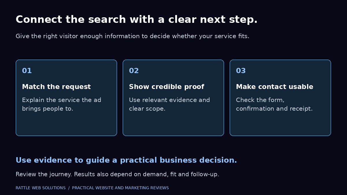
- Search and promiseMatch the advertised service and buyer situation.
- Proof and fitAnswer the questions that affect suitability.
- Contact and reviewConfirm receipt, then assess lead quality.
Begin with the search, not the layout
Before choosing a hero image, write down the search situation. What service does the person need? In which location? Are they comparing suppliers, checking a price, looking for emergency help or researching a future project?
A page for an urgent repair request needs different information from one for a business reviewing annual maintenance suppliers. The first may prioritize availability and a direct contact route. The second may need scope, service coverage, evidence and a discussion about requirements.
Google’s ads and landing page guidance advises matching the page to the ad and keywords, maintaining a relevant call to action, and making navigation and mobile contact straightforward. In practice, build a short brief for each materially different service intent before designing its page.
Do not create a separate page for every tiny keyword variation. Create a distinct page when the buyer needs materially different information. Otherwise you may multiply maintenance work without helping customers.
Use a promise you can actually deliver
The strongest headline is usually more specific than “Grow with our world class solutions”. It states the service, buyer situation or outcome in language the customer recognises.
A hypothetical accounting firm might use “Bookkeeping support for growing service businesses” and then explain the scope beneath it. It should not promise to halve every client’s tax bill. A local venue can state the type of events it hosts and show real capacity details. It should not imply availability that has not been checked.
Use the supporting paragraph to explain what the buyer gains and how the service works. Keep it short enough to understand without scrolling. The headline does not need to carry the whole sales conversation.
A hero copy worksheet
- Service: what are you offering?
- Buyer: who is it suitable for?
- Fit: which location, requirement or project type matters?
- Benefit: what practical problem does it help address?
- Action: what can the buyer do now?
Write one sentence for each, then remove repetition. If the hero could be pasted onto any agency website unchanged, it is probably too vague.
A useful landing page order
There is no universal layout that wins for every business. Start with this sequence and adjust it around the buyer’s decision.
| Section | Its job | Common mistake |
|---|---|---|
| Relevant introduction | Confirm the service and fit | Generic headline unrelated to the ad |
| Immediate next step | Make contact easy | Several equally prominent actions |
| Evidence | Reduce a specific uncertainty | Unsupported ratings or unnamed results |
| Scope and suitability | Help the buyer judge fit | Long capability lists with no meaning |
| Process | Explain what happens after contact | “Discover, deliver, delight” without detail |
| Commercial context | Clarify the buying model | Hiding essential exclusions |
| Useful questions | Resolve remaining objections | Repeating the service text as FAQs |
| Final contact route | Let a ready buyer act | A form with unclear next steps |
For an urgent local service, contact may need to appear more often. For a complex business engagement, evidence and scope may need more space. Use the table as a decision aid, not a mandatory template.
Choose one primary conversion route
A buyer should understand what happens when they click the main button. “Request a service quote” is different from “Book a consultation” and different again from “Check availability”. Choose the action the business can support.
Secondary contact routes can be useful. Some buyers prefer a phone call; others need to describe requirements in writing. Give those choices a clear hierarchy rather than five competing buttons, a chat popup and an unrelated newsletter request.
The form should request information needed for a useful response. A service inquiry may need contact details, location and a short requirement. A complex project may need a website or business context. Avoid collecting personal details merely because a CRM has a field for them.
Explain what happens next using an honest operational statement. If the team reviews scope before proposing work, say so. Do not promise an instant quote when pricing depends on discovery, or a response within an hour when nobody owns that commitment.
Put proof beside the question it answers
Evidence works best when it reduces a real uncertainty. A buyer may wonder whether you understand their type of business, can deliver remotely, or have handled a similar inquiry journey.
A relevant case study can explain the challenge, the work and the evidence of impact. A genuine testimonial can support confidence in communication or delivery. Real service photography can help a local customer recognize the premises or team.
Avoid combining unrelated peaks into a single impressive headline. Do not display revenue, lead counts or return on advertising spend without an approved source and reporting period. Where outcomes are client reported, label that boundary plainly.
Rattle’s SK Party Hall case study describes a local discovery and inquiry channel with evidence boundaries. It is useful context for a local business. It is not proof that a US professional services campaign will produce the same outcome.
If you have no suitable case study, show the actual process, deliverables and account responsibilities. A credible explanation beats a fabricated result.
Explain what is included and what is not
Visitors need to know whether the service fits before they inquire. That often means showing delivery geography, types of work accepted, core inclusions and important exclusions.
For a hypothetical commercial cleaning page, the buyer may need to know property types, service area and whether the quote depends on a site assessment. For a website project, the buyer may need page scope, content responsibilities and the difference between a project and ongoing maintenance.
Specific information can reduce unsuitable inquiries, but avoid turning the page into a contract. Put the decisions that affect initial fit on the page. Confirm detailed terms in the proposal.
Pricing can help qualify buyers when the business has an approved, meaningful starting scope. State a starting price with the conditions that make it valid. Separate management fees from advertising media and optional third party services. Do not use a low headline number that hides the cost of a workable engagement.
Design for a real phone, not just a smaller screenshot
The mobile version needs an intentional reading order. Text should be readable without pinching. Buttons need clear labels and usable touch targets. Form fields should not be hidden under overlays or sticky controls.
Check the first screen on a typical phone. Can a buyer identify the service and next step? Then scroll the entire page. Do images create long gaps? Does a comparison table overflow without an obvious way to read it? Is the inquiry form usable when the keyboard opens?
Keep animation restrained. A subtle entrance effect is rarely more valuable than a fast, stable page. Respect reduced motion preferences and avoid effects that delay the appearance of important text or controls.
Treat decorative imagery differently from informative imagery. A process diagram should carry accurate labels and remain readable on a narrow screen. A background photo should not make the headline difficult to read. Useful visuals explain; they do not simply fill space.
Keep navigation useful
Removing every link can make a page feel like a trap. Sending visitors through a large menu can also distract them. Decide which supporting links genuinely help a buyer judge the offer.
For a higher consideration service, access to About, a relevant case study, pricing context and contact information can support trust. A buyer should not have to leave through an unrelated product or template article to understand who is behind the page.
Internal links should have descriptive labels. “See what is included in website creation” tells the reader more than “click here”. Make sure those destinations support the same commercial story and use current prices.
If the campaign uses a focused landing page within the main website, preserve the brand’s typography, colors and button style. A sudden visual change can create doubt about whether the buyer is still dealing with the same business.
Measure the actual journey
Useful page measurement separates several steps: a visitor sees the page, begins a contact action, successfully sends an inquiry, and is later confirmed as relevant by the business.
A phone link tap proves an attempt to call. It does not prove the call connected. A WhatsApp click proves an attempt to open the channel. It does not prove a conversation happened. A form success event should represent the system accepting a submission, rather than the user pressing a button.
Google Analytics defines separate recommended events for lead generation and later qualification. Implementing them requires a suitable data path and validation. Merely naming an event does not confirm that the business received a lead.
Use the conversion tracking service when the event definitions or handover into business records need attention. The qualified lead guide helps agree what the sales team should accept or reject after receipt.
A launch check worth doing
Before sending paid traffic, review the page against the ad it will support. Confirm the service, location, offer and action match. Check every important link and remove sample testimonials, placeholder logos and outdated prices.
Review the page on desktop and mobile, including keyboard navigation and form validation. With the right permission, make a controlled test inquiry, verify its receipt and confirm the agreed measurement fires once. Check a failure case too: an invalid field should show a clear, usable explanation.
Confirm who receives notifications and who checks the lead queue. Save a record of the tested version and any known limitations. If a serious inquiry delivery problem remains, the campaign should not treat the page as ready merely because it looks finished.
How to improve after launch
Review the page alongside search terms, geography, device mix, inquiry quality and sales feedback. A weak result can come from irrelevant traffic, an unclear offer, delivery problems or a combination. Do not change all of them at once and then claim the page caused the improvement.
Choose a specific hypothesis. For example: “Buyers cannot tell whether we serve commercial properties, so residential requests are arriving.” You could clarify suitability in the headline and form, then review the proportion of relevant inquiries over an appropriate period.
Set the success condition before changing the page. Consider the inquiry volume and sales cycle. A small business with a handful of monthly opportunities may need a longer review window than a high volume booking service. Avoid declaring a winner from a few visits or a single sale.
Keep a short change log: what changed, why, when, and which outcome will be reviewed. The point is to learn something useful, not to maintain an impressive experimentation spreadsheet.
When a new page is the right next step
A dedicated page can be appropriate when the existing website cannot explain the advertised service clearly, when distinct buyers need different information, or when the contact journey needs a focused rebuild.
It is less likely to solve irrelevant search targeting or a service the market does not want. Establish those boundaries before commissioning pages for every campaign.
If you need a coherent campaign and inquiry journey, review Google Ads management and WordPress website creation. To discuss which gap deserves attention first, share your current situation.
Questions about service landing pages
Should a landing page have FAQs?
Use them when buyers have genuine unresolved questions about scope, fit, process or commercial arrangements. Do not add a long FAQ section simply because another page has one. Important information should also appear where it naturally supports the decision.
Should every campaign use the homepage?
Only when the homepage matches the campaign’s service and buyer intent closely enough. A general homepage may be unsuitable for a narrow offer. Review relevance before creating or choosing the destination.
How many fields should the form contain?
There is no universal number. Include the minimum information needed to respond and judge initial fit. Test whether each field serves a real purpose and whether the buyer can complete it comfortably on mobile.
Will a better landing page guarantee more leads?
No. It can improve clarity and remove friction, but outcomes also depend on demand, targeting, competitiveness, pricing, delivery and follow up. Evaluate the full journey and the quality of resulting inquiries.