A color palette can look appealing in a presentation and become difficult to read on a phone. Review how your colors work in the places buyers actually encounter them before deciding whether your identity needs to change.
Begin with real applications
Collect your website header, a service page, a proposal and a social post. Compare the logo, headings, links and buttons. Note inconsistent shades, text that disappears into its background and places where the design relies entirely on color to explain a choice.
Check these four combinations
- Body text on the main page background.
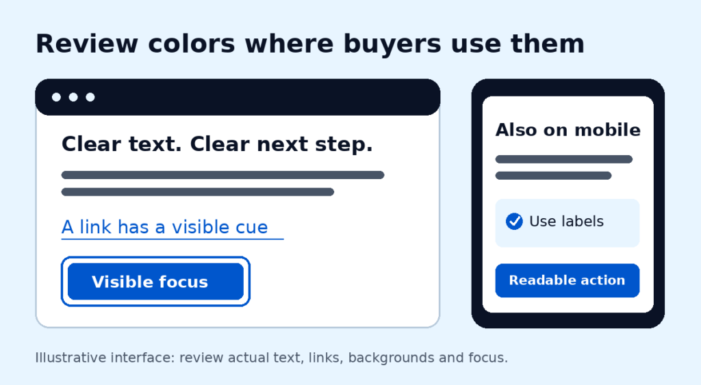
- Button labels on their default, hover and focus backgrounds.
- Links within paragraphs, including a cue beyond color where needed.
- Charts, alerts and selections that also need words, labels or shapes.
Check text and background combinations against the relevant WCAG contrast guidance. A bright brand color may work well as an accent but need a different treatment behind small text. Inspect the actual rendered combination, not just the palette swatch.
Consider context before meaning
Do not assume a color creates the same response in every market or category. Existing recognition, nearby colors, imagery and a buyer’s expectations all matter. Claims that a particular shade automatically builds trust or drives customers away need evidence that a palette alone cannot provide.
Use a hypothetical example carefully: if a pale accent makes a contact button hard to read, increasing contrast addresses a readability problem. It does not prove that the original color caused lost sales.
Improve the system before replacing it
Define a small set of text, background, accent and action colors. Record their approved combinations and apply them consistently. Review mobile screens and keyboard focus states as well as desktop layouts. Keep recognizable elements where they still serve the business.
Does a readability issue require a rebrand?
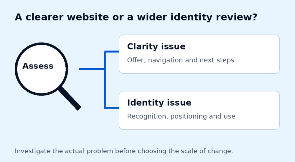
Often the immediate task is to adjust how existing colors are used. A broader identity review needs a separate assessment of your positioning, recognition and practical requirements.
Reference: W3C guidance on minimum text contrast.
If the issues appear mainly on your website, review the scope of our WordPress website design service before commissioning a wider identity change.
We’ll assess your current brand applications and recommend a direction based on the problems we find. Every business has different constraints; a new palette is not an automatic starting point. Discuss your requirements.